Visualize and communicate risk in Power BI
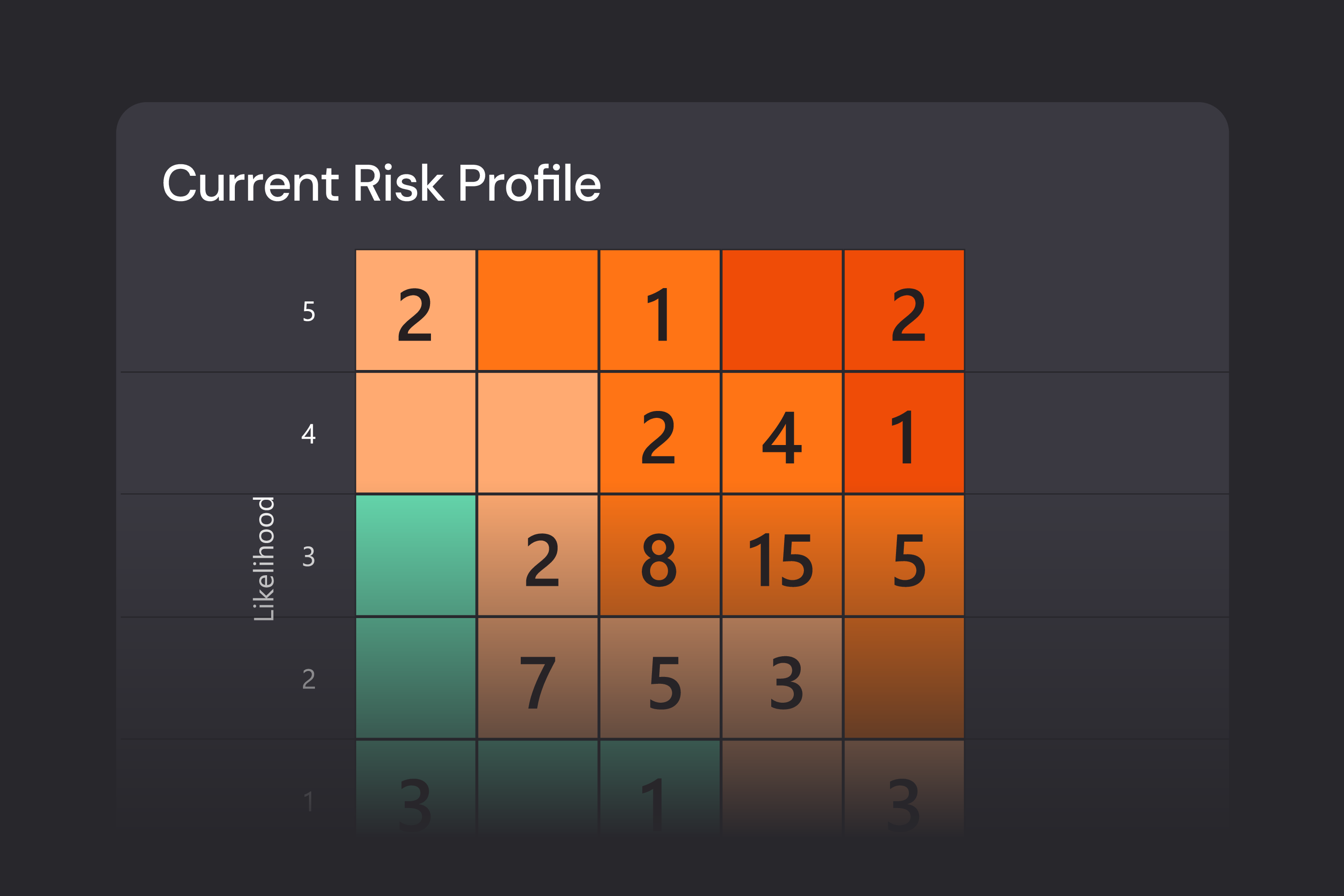
A risk matrix is one of the most familiar and effective ways to identify, assess, and communicate risk—but in many organizations it still lives in static slides and spreadsheets. Risk Matrix by Profitbase is a Microsoft‑certified Power BI visual that turns your risk register into a dynamic, fully customizable matrix, showing likelihood versus impact with bubble size driven by business‑critical metrics such as financial exposure. It lets you see both the big picture and the details, and use the matrix as an interactive starting point for deeper risk analysis in your dashboards.
Designed for how you work
Familiar view of risk
Many risk reports are still distributed as static heatmaps in PowerPoint or PDF, which quickly become outdated and make it hard to drill into individual risks. Stakeholders recognise the matrix layout, but they can’t interact with it or easily understand what sits behind each coloured cell. Risk Matrix by Profitbase lets you plot risks in a classic likelihood–impact matrix directly in Power BI, using the same visual language risk owners and executives already understand. Each bubble represents a risk, positioned by its probability and consequence, so users can instantly see which risks matter most before drilling into the details.
Configurable to your framework
Different businesses use different scales (3x3, 5x5, 10x10), naming conventions, and color schemes for risk levels. Standard visuals often force you into a fixed layout, which makes it harder to align with your existing risk policy and causes confusion when reports don’t look like the framework people know. With Risk Matrix by Profitbase, you can configure the matrix size from 1x1 up to 10x10, define your own axis labels, and adjust background colors for each individual cell or section to reflect your risk criteria. Bubble sizes can be tied to a metric such as potential financial loss or exposure, so the visual speaks the same language as your risk methodology instead of forcing compromises.
From visualization to insight
Traditional risk matrices look good in presentations but don’t help much when you need to investigate why a risk is rated the way it is or what actions are planned. Analysts have to jump between files or tools to connect the dots, which slows down decision‑making. Risk Matrix by Profitbase is fully interactive: clicking on a bubble filters the rest of the Power BI report, so you can immediately see full descriptions, owners, mitigations, incidents, or financial details in other visuals. This makes the matrix a natural entry point into your risk data rather than just a static picture.
Feature overview
Plot risks in a classic likelihood-impact matrix directly in Power BI.
Change the matrix size from the default 5x5 to anything from 1x1 up to 10x10 to match your risk framework
Customize axis and category labels to reflect your organization’s risk terminology.
Set background colors for each cell or section to indicate severity levels (e.g., green/amber/red).
Control bubble size based on another value such as potential financial loss, exposure, or risk score
Use the matrix as a filter—select a bubble to filter other visuals and see full risk details.
Change the number of axis categories without rebuilding the matrix
Edit category labels directly from the visual’s format settings for quick alignment with your risk policy
Adjust bubble appearance and sizing to keep the matrix readable even with many risks
Apply color settings from the format pane and cycle through them when designing the matrix layout
Interact with other report visuals, enabling end-to-end analysis from risk overview to underlying data
Install the visual directly from Microsoft AppSource into Power BI Desktop or Power BI Service.
Follow step-by-step configuration guidance and video tutorials provided via the GitHub repository
Benefit from ongoing maintenance and support via GitHub issues and discussions managed by Profitbase
See how Hypergene can support your organization
Hypergene gives you the tools to manage planning, follow‑up and analysis with clarity and confidence. See how in a demo.