Visualize and distribute project plans in Power BI
Project and resource plans often live in complex planning tools that only a few people can use, while everyone else manages with outdated PDFs, screenshots, or spreadsheets. Gantt by Profitbase is a Microsoft‑certified Power BI visual that takes plans from your existing systems and displays them as an interactive Gantt chart with unlimited hierarchy, milestones, and events—without allowing accidental edits. This lets planners keep full control in the planning tool while stakeholders get a clear, always‑up‑to‑date view of timelines, progress, and dependencies directly in Power BI.
Designed for how you work
One plan, the same version for everyone
Many organizations invest in powerful planning systems, but only planners ever log in. Everyone else works from exported files that are out of date almost as soon as they’re sent. That leads to confusion about “which version is correct” and forces planners to spend time maintaining static reports instead of managing the plan. Gantt by Profitbase connects to the same data that feeds your planning tool and visualizes it as an interactive Gantt chart inside Power BI—without turning Power BI into yet another place to maintain plans. Planners remain in charge of changes, while managers and team leads can explore timelines, drill into tasks, and stay informed through the reports they already use.
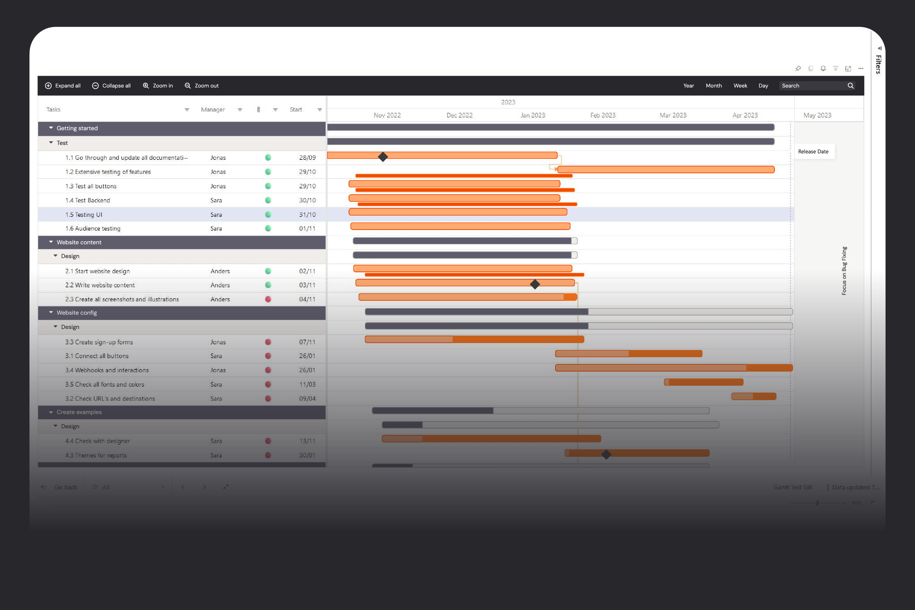
A project view everyone understands
Traditional Power BI visuals aren’t designed for project timelines. It’s hard to show multi‑level work breakdown structures, dependencies, milestones, and “curtains” for shutdown periods or holidays in a way that project managers recognize. The result is often a mix of tables and charts that still don’t look like a proper Gantt chart. Gantt by Profitbase is built specifically for this use case: it supports unlimited and ragged hierarchies, multiple milestones per task, static events, event ranges shown as curtains, and dynamic event markers pulled directly from your data. You can format each hierarchy level differently, zoom the timeline from years down to minutes, and add extra columns for status, owners, or KPIs—so everyone sees the project in the structure they’re used to, but with the interactivity of Power BI.
Governance & data integrity
If every manager can edit dates and durations wherever they view the plan, it quickly becomes impossible to know which version is the truth. Changes to one task can impact others in ways that are hard to see, and ad‑hoc edits in reporting tools undermine data integrity and governance.
Gantt by Profitbase is intentionally not a planning tool. It is a read‑only Power BI visual: managers and stakeholders view and interact with the plan, but any changes must still go through the dedicated planning system. Combined with the fact that the visual is Microsoft‑certified and runs in a sandboxed Power BI environment, this gives you a secure way to distribute sensitive project data at scale without opening up uncontrolled edit paths.
Feature overview
Visualize projects and tasks on a time axis directly in Power BI, perfect for project and portfolio management.
Build unlimited, multi‑level task hierarchies, including ragged structures that reflect real‑world work breakdowns.
Format each hierarchy level differently to highlight projects, phases, and tasks with clear visual cues.
Add multiple milestones per task to track key dates such as start, finish, handovers, or approvals.
Display static events (e.g., releases, audits) that are not tied to a single task but still impact the timeline.
Show event ranges as “curtains” across all tasks to visualize shutdowns, maintenance windows, or holiday periods.
Zoom the timeline from years down to minutes using built‑in zoom buttons for both long‑term planning and daily execution views.
Use a Today‑line to keep everyone oriented on where they are relative to deadlines and milestones.
Sort, filter, and search across all columns to quickly find specific projects, tasks, owners, or statuses.
Add additional data columns (e.g., responsible person, status, budget, risk) directly to the Gantt for richer context.
Apply conditional formatting to highlight late tasks, critical milestones, or other key conditions.
Change the time header granularity (years, months, weeks, days, hours, minutes) based on the level of detail needed.
Use predefined theming templates to keep formatting consistent across reports and workspaces.
Cross‑highlight and cross‑filter with other visuals to connect project timelines with resource, cost, or risk data in the same report.
Export certified visuals as part of Power BI reports to PDF or PowerPoint, supporting management reporting packs.
Install and update through Microsoft AppSource, with a one‑month free trial and simple named‑user licensing.
See how Hypergene can support your organization
Hypergene gives you the tools to manage planning, follow‑up and analysis with clarity and confidence. See how in a demo.